

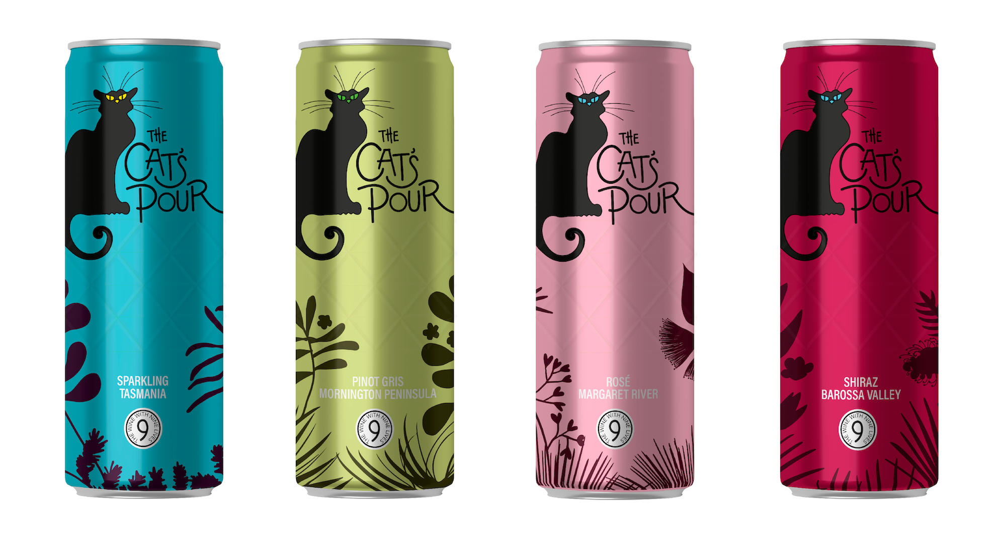
the cat’s pour
student project | 2022
Branding and packaging for a premium wine range that offers a more sustainable alternative to traditional glass bottles. Introducing The Cat’s Pour, quality Australian wine in a can.


Inspired by the iconic posters for the Parisian night club Le Chat Noir dating to the 1880s, the black cat imbues a sense of sophistication and intrigue - qualities to appeal to and entice wine drinkers to buy the product.
The logotype is hand-drawn and supported by Acumin Variable Concept Condensed, a simple, compact and modern sans serif, selected to contrast with the art nouveau inspired logotype.


The colours of the wine varietals are brought through to the cat’s eyes and packaging, with the palette reflecting the range of wine varietals.
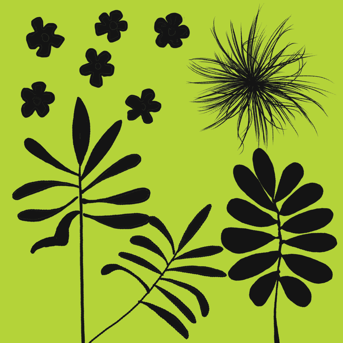
Australian native flora from each grape region showcases the wine’s Australian origins.


Aluminium offers multiple practical and environmental advantages over glass when it comes to wine packaging. Its lightweight qualities make for efficient transportation, it’s infinitely recyclable, chills faster than glass and doesn’t break as easily.


Initial logo concepts played on a visual of a cat’s paw however this could be perceived as unsanitary and therefore not the best imagery for a consumable product.
A circular ‘stamp’ influenced by the aureola around the black cat’s head, highlights the multiple ‘lives’ of aluminium packaging.

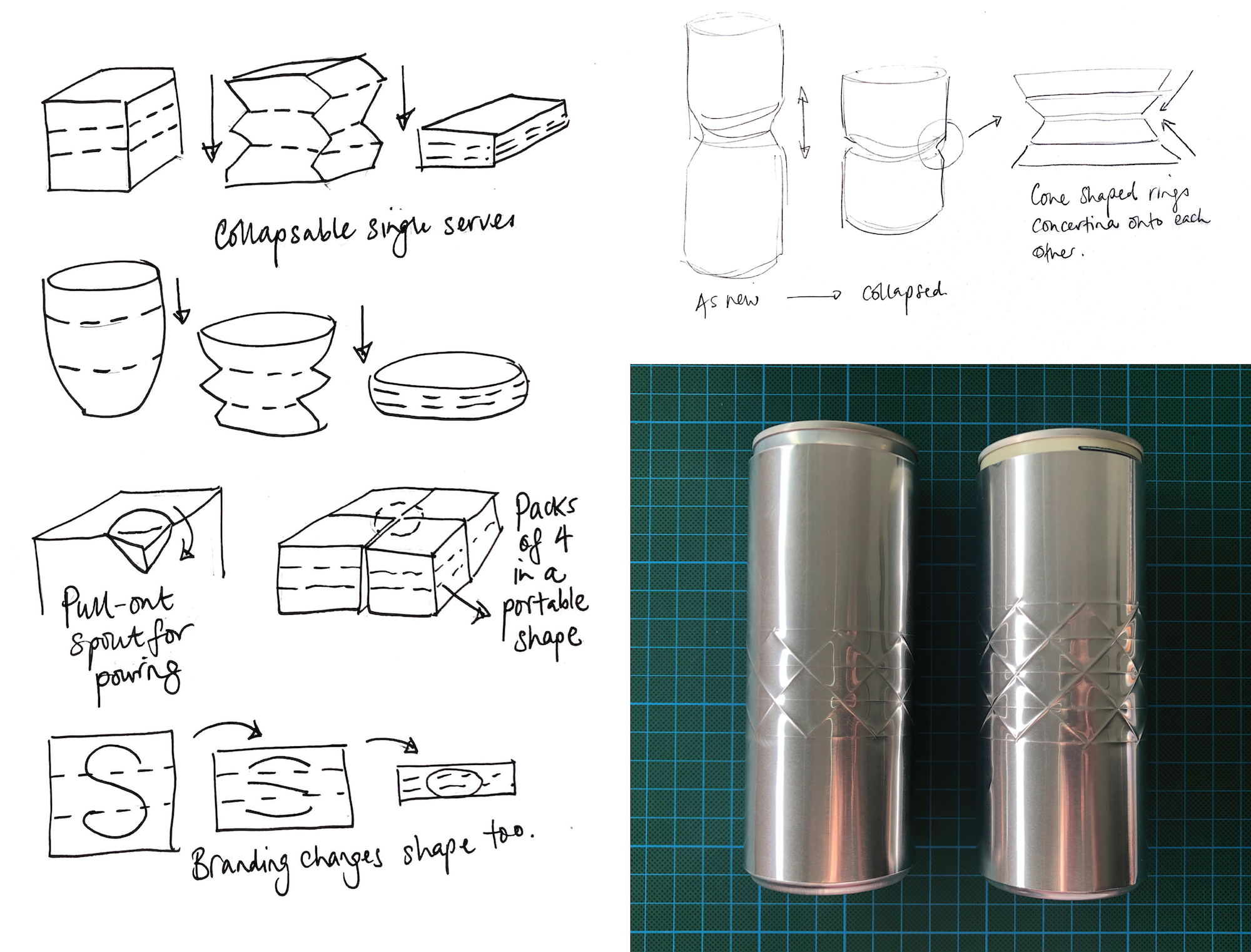
Concept sketches and prototypes led to a diamond-cut can that would add a pleasant, tactile feel while holding - and differentiate from other, ordinary cans.

Colour exploration for wine varietals:
Green and yellow denotes lighter white wines
Blue for heavier whites or cool climate wines
Purple denotes heavier red wines like shiraz
Red for lighter red wines like pinot noir
Pink for rosés

