
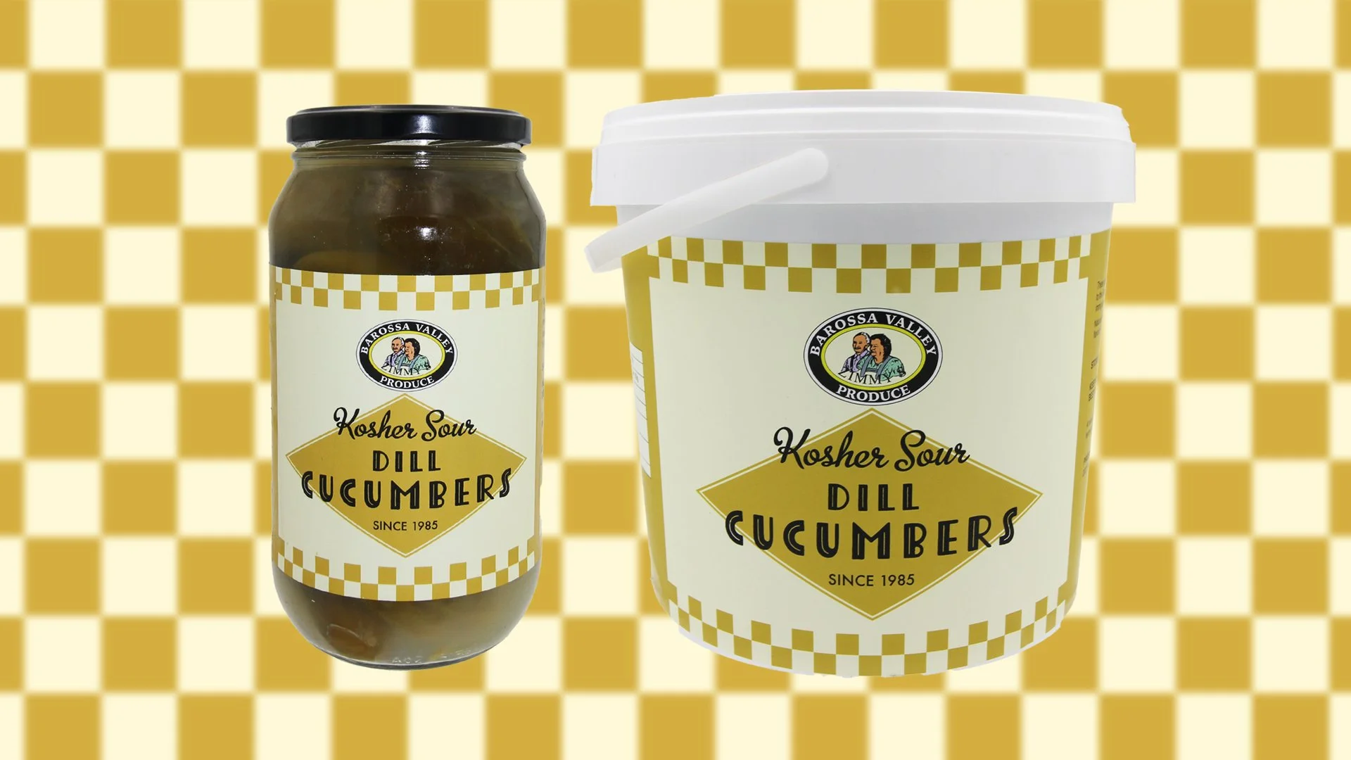
ZIMMy’s sour dill cucumbers
Fino Foods | 2025
A refreshed label design for the product launch of Zimmy’s Sour Dill Cucumbers into Fino Foods.
Fino Foods is a specialty food importer and distributor, working with the best producers in Australia and overseas. They seek out amazing produce and connect it with cutting-edge restaurants, retailers and chefs around Australia.
Fino were launching Zimmy's Sour Dill Cucumbers into their range, a unique product, rarely seen in Australia–until now. Made using a traditional dill brine and natural fermentation process, Zimmy’s distinguishes itself from vinegar-based pickles.
Fino wanted to highlight this distinction to their customers with a refreshed look to the product that would better reflect its uniqueness, superior quality, Kosher heritage and tradition.

Original label © Zimmy’s Barossa Valley Produce
Made using a 100-year-old family recipe and authentic method, Zimmy's Sour Dill Cucumbers are as good as the full sour pickles used by top New York delis, like Katz and Russ & Daughters.
My starting point was to explore the distinctive visual language of classic old-school Jewish delis in New York City.
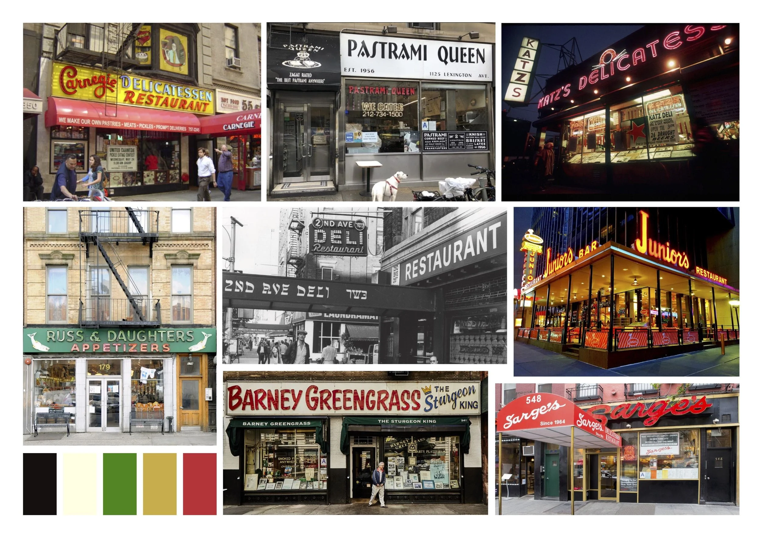
Image sources: From top (l-r) Wikipedia (Carnegie Deli exterior); Pastrami Queen; Jonathan Elderfield Getty Images (Katzs Deli); Russ & Daughters; Getty Images (2nd Ave Deli); Marcos Rivera on Flickr (Juniors Deli); Bon Appetit (Barney Greengrass); Tripadvisor (Sarges)
Typography: handwritten chalkboards, vintage deli-style scripts, 1920s Art Deco
Geometric shapes reflecting checkerboard tiles, storefront signage and neon signage
Colour: muted hues like mustard yellow, inspired by deli interiors; black and off-white echo formica tables and paper menus
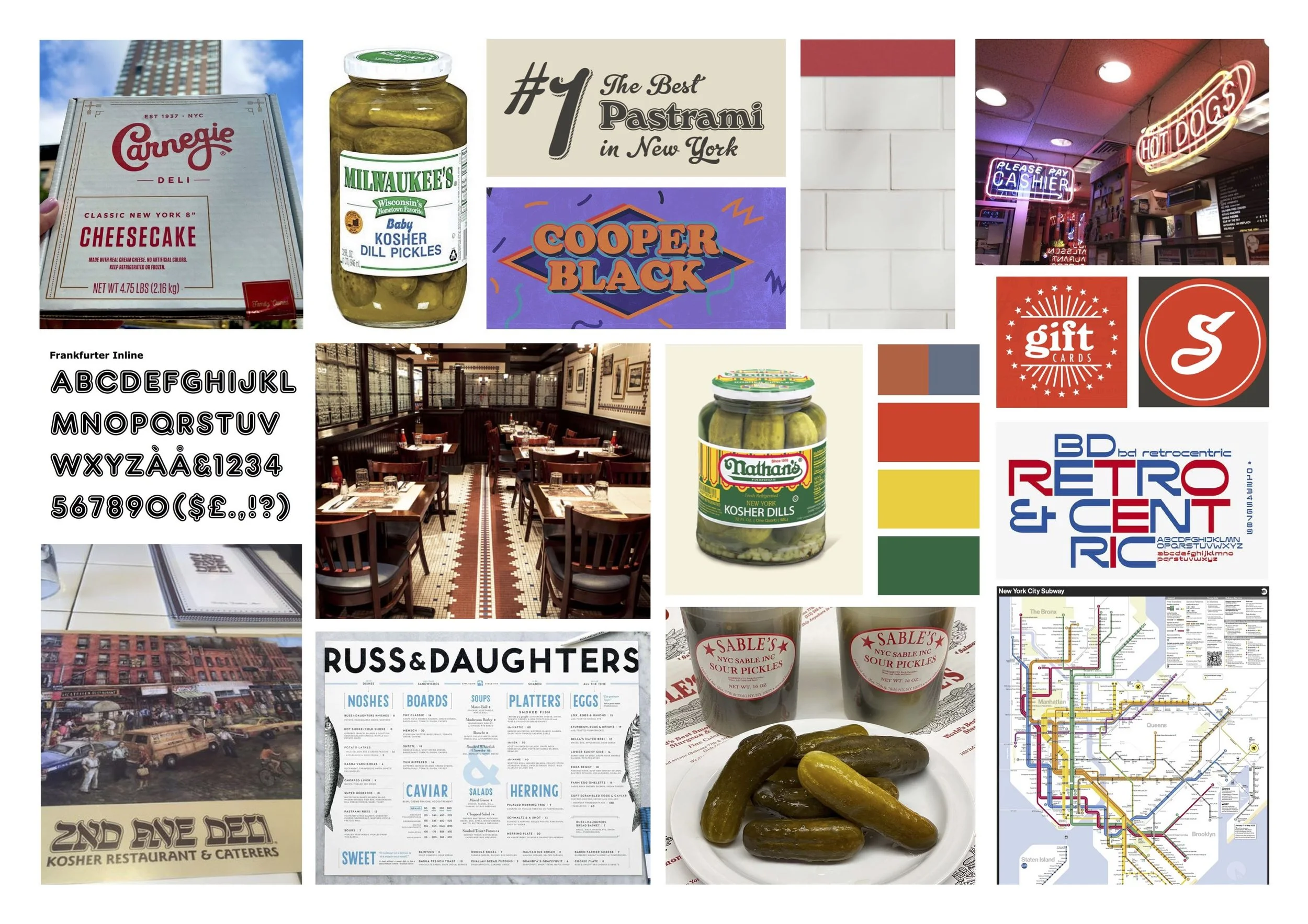
Image sources: From top (l-r) Carnegie Deli; Walmart (Milwaukee's); Sarge's Deli; Adobe Fonts (Cooper Black); Yelp.com (Ben's Deli); Identifont (Frankfurter Inline); Sideways.nyc (2nd Ave Deli); Nathans Franks; Sarge's Deli; Adobe Fonts (BD Retrocentric); Tripadvisor (2nd Ave placemat); Russ & Daughters; Goldbelly (Sable's); Bloomberg (subway map)
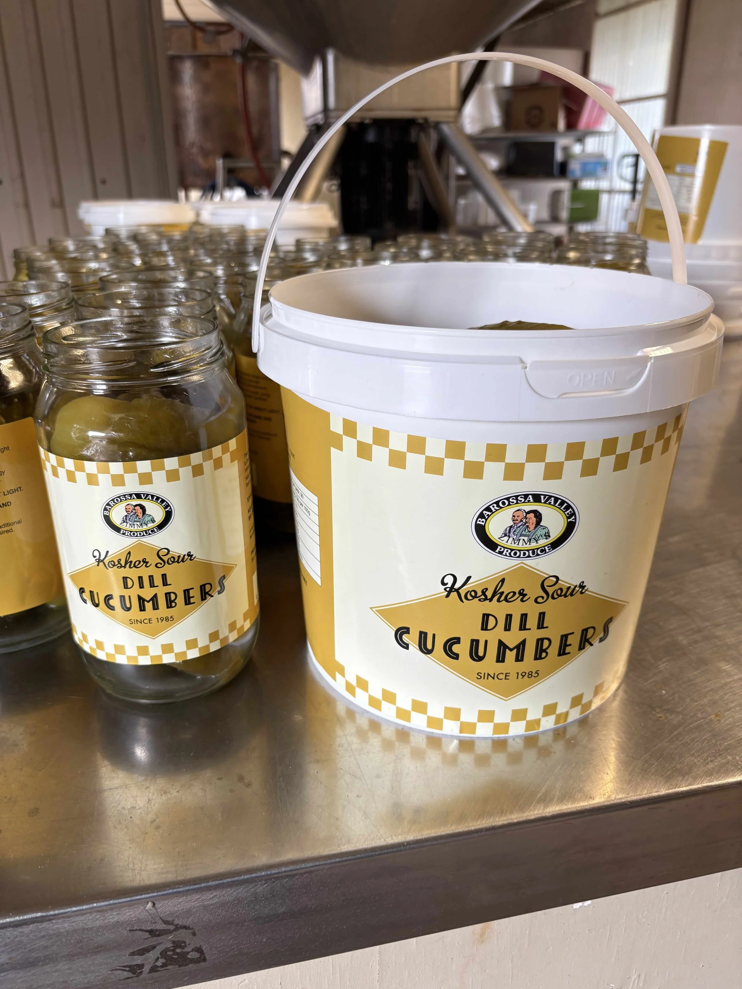
The refreshed label has a clean, uncluttered aesthetic, aimed at elevating the product in a no-nonsense way.
Visual cues evoke an old-school deli tradition and authenticity to instill a sense of history and knowledge that the contents are “the real deal”.
“Since 1985” further supports the brand and product heritage.

It was a conscious decision not to use green in the redesign, as it’s frequently used in other pickle packaging and helps to distinguish Zimmy’s from other pickles.
Font selections:
Tomarik Display Line (Adobe Fonts) - a handmade, Art Deco-style typeface, to recollect the 1920s boom of the Jewish delis in NYC
MetroScript (Adobe Fonts) - echos handwritten deli menus
The original Zimmy's Barossa Valley logo is retained from the original label for continuation of the existing brand and quality recognition.
Customer feeback
“Nicola has delivered a vibrant and relevant result with this brief. Not only will it refresh the brand but also bring the product into the "now". The producer is thrilled and it’s fitting for the style of the product.”
Annelies Oldham | Product Development Specialist, Fino Foods
“So excited to see this product hitting the kitchens and shelves. FINALLY! Also the brine makes a mean Martini.”
Fino Customer