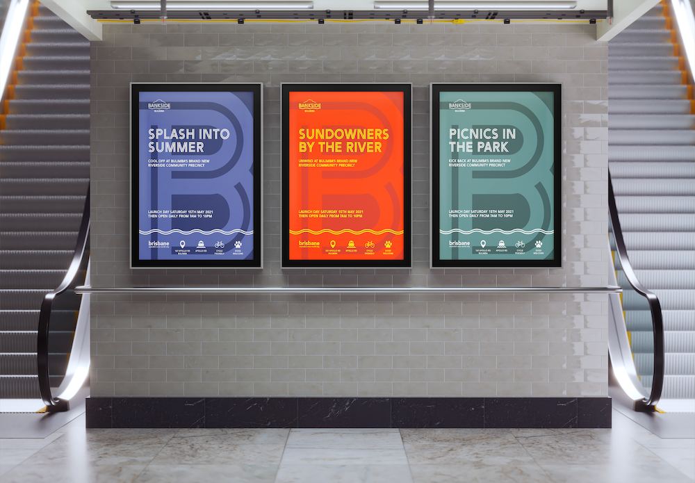
bankside bulimba
student project | 2021
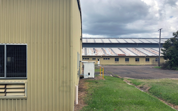
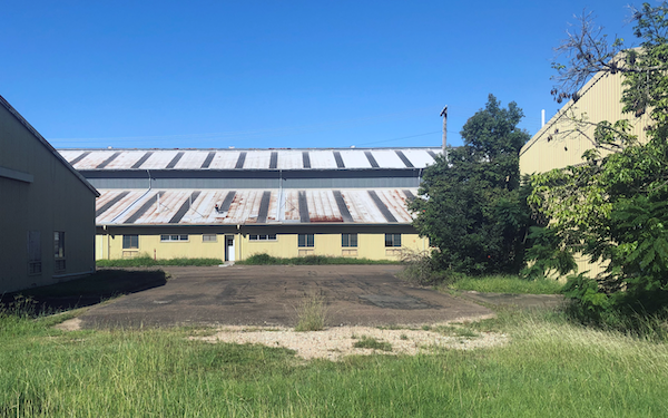
A typographic identity system for a mixed-use recreational parkland located at the old Bulimba Barracks site in Brisbane. The identity echoes the barrack’s maritime and military history and celebrates Brisbane’s native flora and subtropical climate.
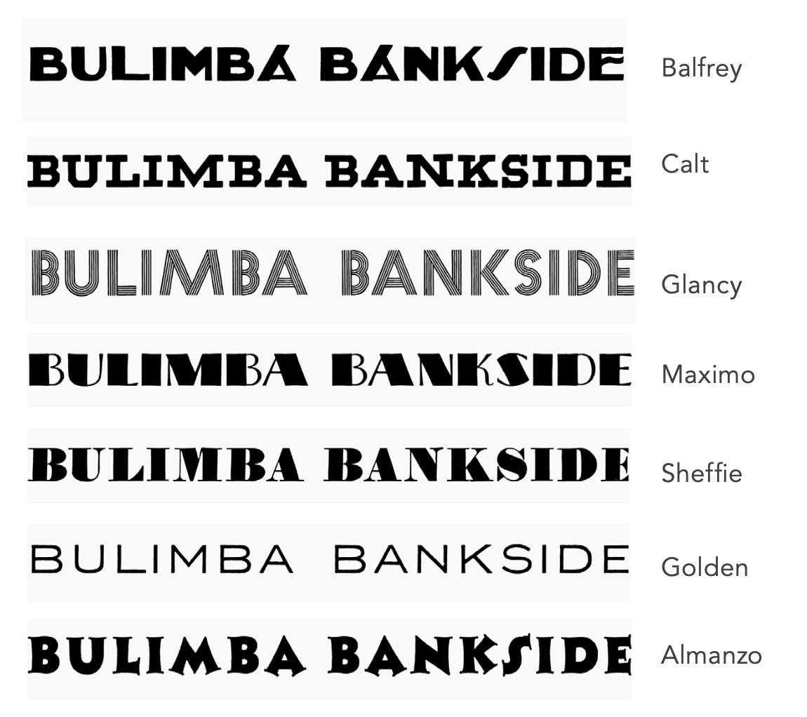
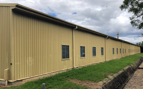
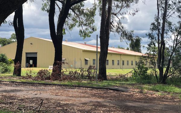
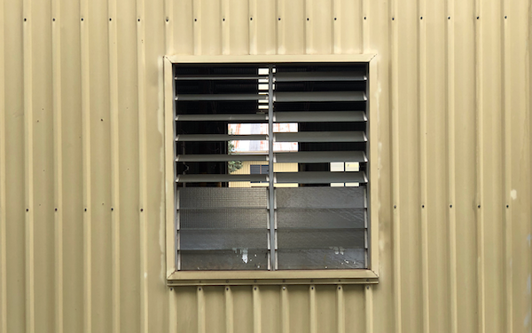
The American Army used the site to build barges during WWII, so inspiration came from American poster typefaces of that era, many of which are only available in capitals.
Arya, a modern upper-case sans serif was selected for its resemblance to iconic 1940s fonts such as Glancy. The inline variation draws parallels with the corrugated iron of the barge construction workshop that still stands on the site.


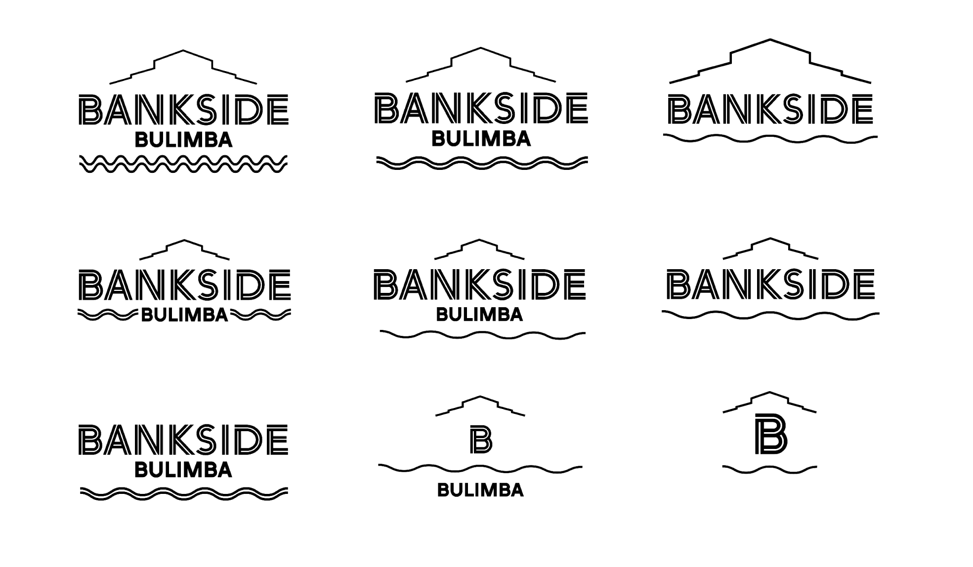


The monogram is used when space is minimal. As the monogram is downsized, the lettering of BANKSIDE changes to a single stroke to ensure legibility.


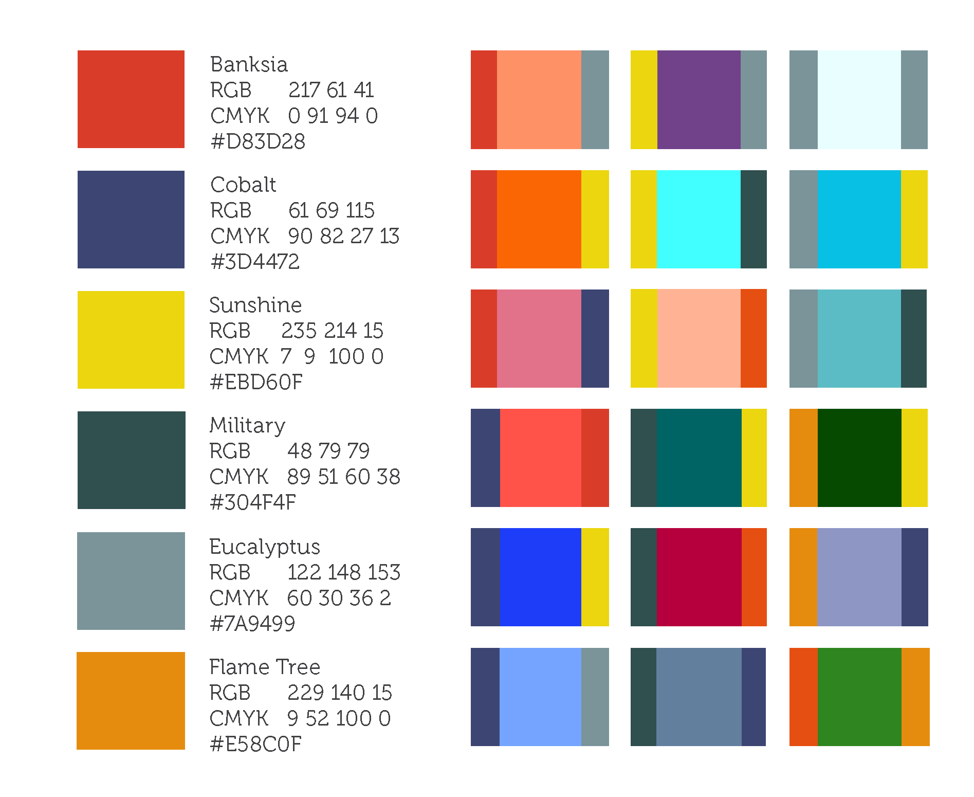

Colours can be blended with each other to reveal the secondary colour palette. This broader spectrum of colours represent the multi-use purpose of the site.

Playing with scale, angles and colour to create abstract patterns. The parallel lines of the letterforms are very distinctive, so even when abstracted, they are still recognisable as belonging to the Bankside logotype.